MAKING RETIREMENT PLANNING MODERN
Retirement Plan Advisors
OPPORTUNITY
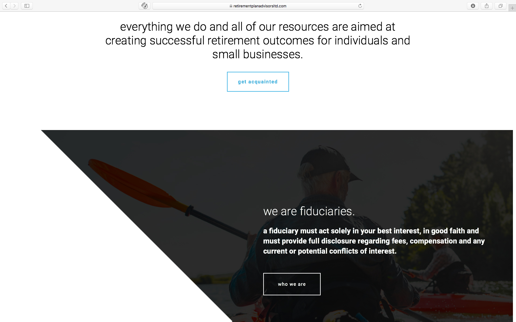
Retirement Plan Advisors, Ltd. (RPA, fondly) needed to modernize their brand and website. Retirement planning can be a confusing and scary topic, so the goal was to modernize and offer content with a modern visual appeal.
In addition, RPA is a registered fiduciary. Most registered financial advisors are only held to a "suitability" standard – their recommendations and actions for a client are required to be merely suitable. By registering as a fiduciary, RPA is required by law to do everything solely in the client's best interest. This higher standard needed to be apparent in their branding and website.
OBJECTIVES
Develop a modern and elegant brand identity.
Apply identity across applications from print to web.
Provide usable brand guidelines for customer.
PLANNING & EXECUTION
During the discovery process, we identified several areas the client wanted to explore with their new branding: space, simple shapes, and bold colors. Once rebranded, the new website and other applications needed to be user friendly, not intimidating, modern, easily understood, and written in a friendly language.
THE LOGO JOURNEY
After meeting with the client, we created several logo concepts. Each concept has a mark, distinctive fonts, and a color palette. As you can see from this sampling, the client quickly determined a color story they wanted to stick with and decided the simpler the better (which we're totally on board with!).
Many financial advisors use lighthouses (yeah we did one of those for another client, but it was cool), oak trees, and a few other common visual themes. RPA originally thought they'd like an astronomical theme, but after exploring several of those, we-all headed in different directions. We also decided to explore directional marks and once the mark was chosen, we explored many font options and weights. Here's a sampling, because seeing is believing!
DRUMROLL PLEASE
Here is the final logo!
APPLICATIONS
Branding isn't static and must work across multiple applications.
STATIONERY, IMAGE STORY, BRAND GUIDELINES, AND WEBSITE


RESULTS OVERVIEW
We worked closely with their team to redefine RPA's branding from logo to language and extended that into a stationery system and responsive website. The brand guidelines allow them to now utilize these elements across multiple applications as well as the training they needed to manage the content on their new website.


